

The sign said ten kilometres per hour.
We were still in the car, still on the approach, and the school had already told us something about itself. Slow down. There are children here.
I have thought about that sign a great deal since.
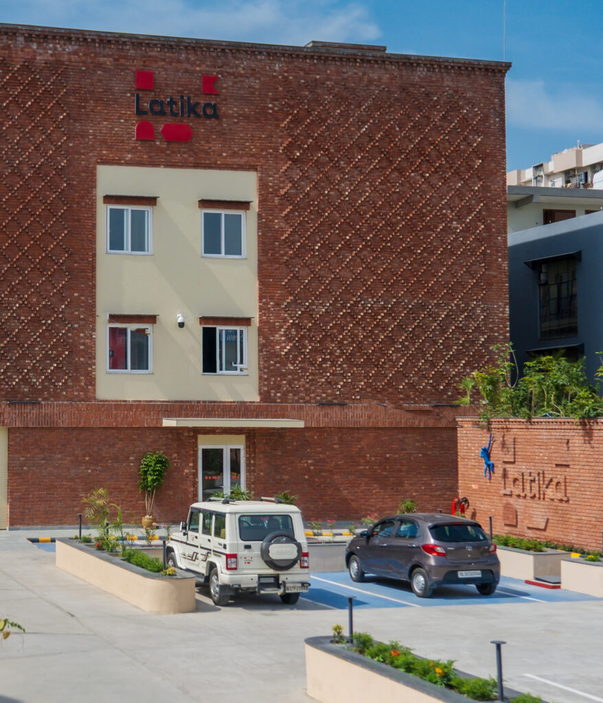
The road curves in from the main street and the building sits back from it, screened by green. Two marked lanes for vehicles, which sounds like a small thing until you consider the alternative, which is a driveway where cars reverse unpredictably and a child has to be held by the wrist. Here the traffic is organised so that the child does not have to be.
Then you see the building itself, and the first surprise is that it is large without being loud.
I did not expect that. Most spaces built for young children in India are loud. Lovingly, deliberately loud: colours on every wall, cartoon animals, dinosaurs, shapes, all of it assembled by people who care enormously and who have absorbed somewhere the idea that a stimulating environment means an environment full of stimulus. Special needs settings are often louder still, as though the answer to a child who processes differently is more input rather than less.
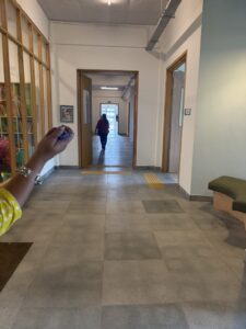
Latika is restrained, and the restraint is clearly a decision. Yellow tactile tiles. Curved corners throughout. Fittings set at child height.
Inside the entrance there is a reception desk, and the desk is at two heights.
One at standing height. One lower, for a child or a person using a wheelchair.
I stood in front of it longer than was probably normal.
Somebody had to argue for that desk. Somebody had to explain to a contractor why the standard unit would not do, probably more than once, and probably paid more for it. The result is that a child arriving in the morning is met at eye level. Nobody bends over them. Nobody talks above their head. Before a single word is spoken, the building has said something about who counts here.
Then you walk further in, and the second thing is space.
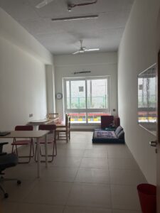
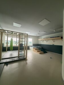
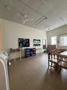
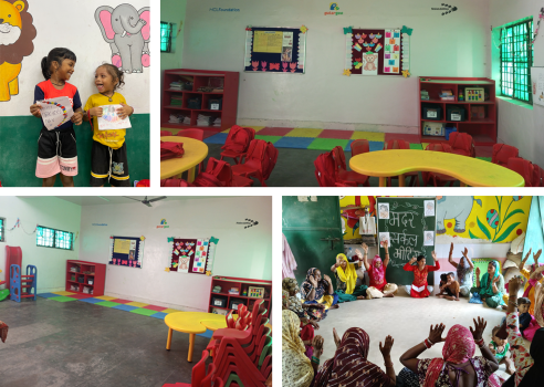
Every room has emptiness in it. Furniture pushed to the walls. Floors clear. Ceilings higher than they need to be. Light entering through glass on multiple sides without the noise that usually accompanies it. Nothing crowds you. Nothing is stacked in a corner waiting to be knocked over.
A child who moves unsteadily, or uses a walker, or needs to pace when overwhelmed, can do all of that without navigating an obstacle course.
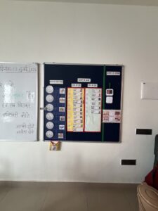
The colours are calm. Not absent, chosen. The walls are not shouting.
And once you have been inside a childhood space that is not shouting, you begin to notice how much all the others are.
For a child with sensory sensitivities, that difference decides whether a day is manageable. But here is the thing I keep returning to: the calm room appears to work better for everybody. Nobody is more regulated in visual noise. We have simply been assuming children want it. Possibly because it is what we remember. Possibly because bright things photograph well.
There is one exception, and it is deliberate.
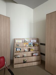
The library is the most saturated room in the building. Bright, colourful, dense. Staff explained the reasoning: children who avoid fluorescent colour elsewhere still respond to it as a draw when it is contained to a single space. So the colour is concentrated there, in one room, on purpose, and children want to go into it whether or not they have a session booked.
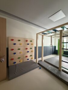
The details accumulate once you start looking for them.
Every edge is rounded. Every chair has armrests on both sides, so a child who needs bilateral support is not propped on one side and tilted on the other. Most things are on wheels, which means a room is not a fixed thing. It becomes what the day requires. There is a large multipurpose room that used to be two rooms until a funder suggested taking down the dividing wall. Now it is a dance hall, an activity space, a place for eleven children or for two.
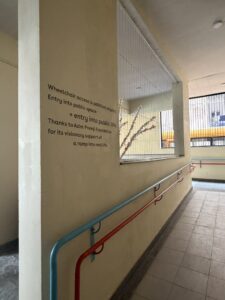
A ramp runs the full height of the building, so a wheelchair user travels from the ground floor to the second without assistance and without a separate route.
Floors are colour coded rather than signposted. Teal, lavender, pink. You orient by colour, which is useful if you cannot read, and quicker even if you can.
That connects to a decision in the library that I liked enormously. There are no push and pull signs on the doors. When I asked, the answer was simple: there is already too much to read.
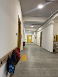
The toilets are Western style and Indian style, at multiple heights, gender specific. Staff described this as protocol. But it does something else too. Children learn the distinction between public and private space. You knock before entering a classroom. You do not knock before entering a public area. That distinction is obvious to most adults and is taught here, explicitly, through the building.
None of this is expensive in the way people assume accessible design must be. A rounded edge costs no more than a sharp one. Emptiness costs nothing at all. What it costs is thought, and a willingness to ask a different question at the outset: what does this specific child’s body actually need in order to be comfortable here?
The building is the answer to that question.
In one of the physiotherapy rooms, a boy was having what the staff described as a sensory time. Overwhelmed, needing something.
They gave him cars. Different sizes, different wheels. He rolled them across the floor, and what he was after was the vibration, the feeling of it through his hands and the sound of it coming back up.
That was the intervention. Cars on a floor.
Nobody at Latika used the word technology all day. There was no talk of AI, no dashboards, no devices with proprietary names. There is one app, Avaz, used for children with limited speech, and it does exactly what it is supposed to do and no more. Everything else is physical, simple, and worked out by people paying close attention over a long period.
There are hammocks. Textured surfaces. A quiet room and, separately, a wiggle room, one for when a child needs less and one for when a child needs more. Both are taught to parents as things they can build at home, not held as institutional property.
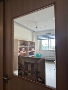
Then there are the mirrors, which are in every room, and which I assumed were for visibility. A way for staff to see round corners.
The explanation was better than that.
When a child is in the middle of a meltdown, or in the middle of great joy, a mirror lets them see their own face doing it. They see what this state looks like on them, in real time, while they are inside it. Over months, that becomes recognition. And staff shared that in their experience, recognition becomes the beginning of regulation.
A teacher explained this as though it were entirely ordinary. It is in every classroom. It costs almost nothing.
But the thing that has stayed with me longest happens every morning at the library door and takes about four seconds.
Children arrive. They find their own photograph. They place it in the box.
That is the whole ritual.
Some children recognise the picture. Some recognise the first letter of their name. Some do not recognise anything yet, and a friend moves the card for them, which is also part of it.
Staff call this the first step towards literacy, and they are right, but it is doing more than that. You are here. You are known. There is a version of you in this room already, waiting.
Consider what is not happening in that moment. Nobody is being assessed. Nobody is measured against the child beside them. Nobody is asked to demonstrate that they have improved since last week. The recognition is unconditional, given at the start of every day, to everyone, in the same way.
For children who spend a great deal of their lives being evaluated by professionals, that is not a small thing.
The wins here are in the everyday. The child who found their photograph. Who walked in without distress. Who chose their own book, which is itself a significant act for a child who is rarely offered a choice about anything.
Near the end of the day the team said something that reframed the whole visit.
Latika increasingly sees itself as demonstrating something. Demonstrating that this kind of building is not expensive and not difficult, provided it is built in from the beginning rather than added afterwards.
A ramp retrofitted is hard. A ramp designed in is just a ramp.
That may end up being their real contribution to the larger ecosystem, now that there is a purpose-built building to point at. I think they are right, and I think the argument goes further than they claimed for it. The high ceilings, the natural light, the clear floors, the calm walls, the desk at two heights: none of these are accommodations for a particular kind of child.
They are just what a good building for children looks like.






 )
)